Clustering Analysis and 3D Visualization Dashboard
A dashboard for analyzing datasets by using K-means and Hierarchical clustering algorithms. This tool helps determine the optimal number of clusters and provides detailed 3d visualizations and comparisons of clustering results.
🎯Click here and Try it out
(plz get it back up and wait it waking up for a moment)
Project Details
Here’s more detailed information about it:
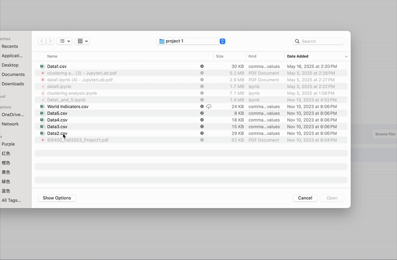
- Multiple Data Sources: Analyze built-in sample datasets or upload your own CSV files
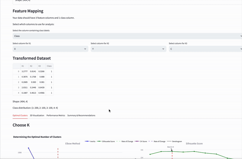
- Custom Dataset Mapping: For uploaded files, map columns to appropriate features
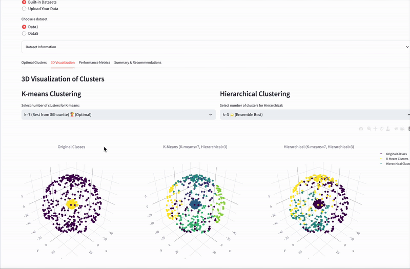
- Interactive 3D Visualizations: Compare original data with K-means and Hierarchical clustering results
- Optimal Cluster Detection: Automated determination of the optimal number of clusters using:
- Elbow Method
- Silhouette Score
- Calinski-Harabasz Method
- Ensemble approach combining all methods
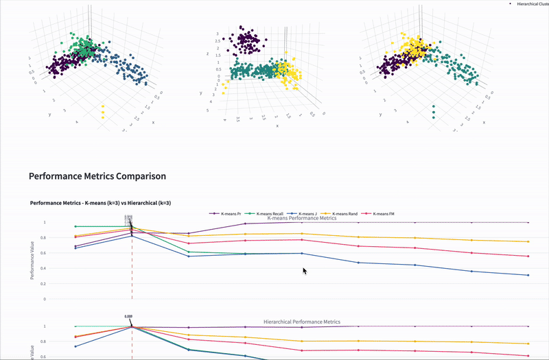
- Comprehensive Performance Metrics:
- Precision, Recall, Jaccard Index
- Rand Index
- Fowlkes-Mallows Score
Technology Stack
- Python
- Streamlit
- Pandas
- NumPy
- Plotly
- Scikit-learn
- SciPy
- kneed